Zeit

What the what, time travel isn’t real...
Well, not yet.
The nature of this project could also be related to any emerging product or service that disrupts social paradigms.
Branding & Web Design, Personal Project
UX / UI Designer
2 months (April - May 2021)
User research and persona creation
Information architecture
UX / UI design
Prototyping and User testing
Iteration

Engage and sustain interest for a new travel service
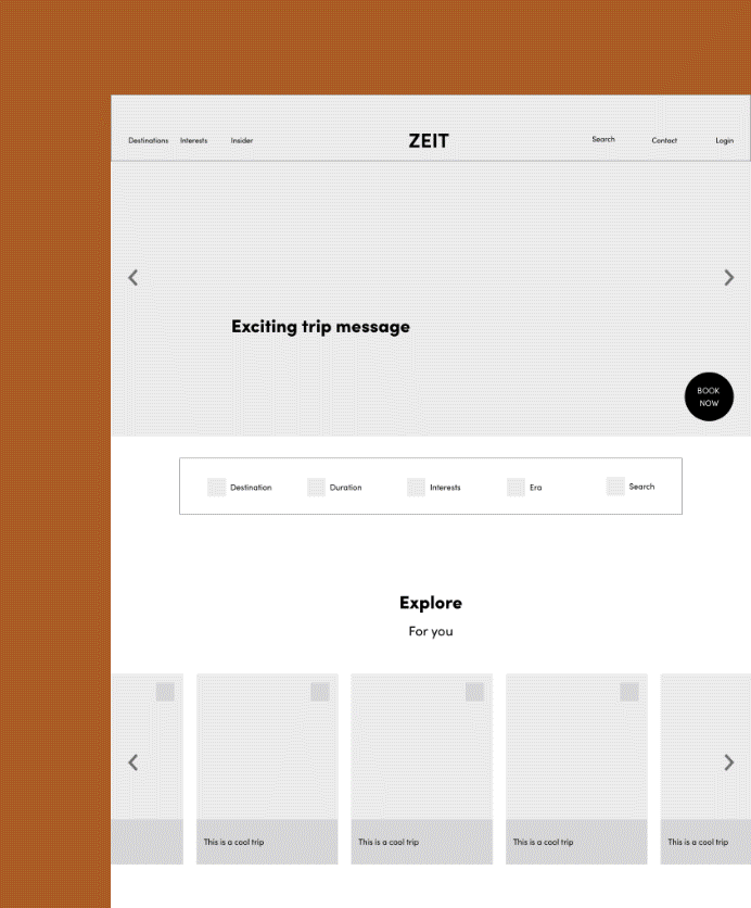
Design a responsive e-commerce website that is easy to use and allows customers to browse through all the different trip categories and details, filtering depending on interests and classifications that are relevant.
• Maintain a level of interest in a new product
• Understand users needs and fears
• Easy browsing experience and booking process
Addressing shared fears and improving booking quality experience
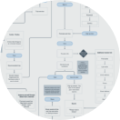
One of the main considerations I took into account when creating the information architecture for this site is the specific content that users prioritized in order to make an informed decision. When users described past travel planning experiences during interviewing, a multitude of emotions were expressed. From anxiety, overwhelm, excitement, and frustration. It wasn’t enough to provide helpful resources so the user can make an informed choice, but to also provide affordances such as a ‘save for later’ button and a customer review section so the user can feel reassured in their choice.
There was a dichotomy in how the site needed to present: it needed to feel exciting, be serious in its messaging regarding safety, list comprehensive details regarding a specific trip, and not overwhelm.
Early paradoxical insights
Early on, it came to light from user interviews some common recurring behavioral patterns amongst experienced travelers. The goal was to understand this demographic to create the most optimized experience.
1. A strong need for flexibility and independence: These characteristics translated to the booking process and incorporating a more collaborative trip planning experience.
2. Research over planning: A need for well-informed guides and informational articles all in one place.
3. Desires options: Strong ability to adapt well to changing plans. Meaning, they would still like to have backup plans A-C as to how they best use their time. Day guides, group activities, and ‘best of’ lists help them navigate.
Competitive analysis
To understand the booking process, I analyzed Conde Nast Traveler, Airbnb, Kayak, National Geographic Expeditions, Rick Steves. It became clear that competitors either specialized in providing well-researched content or as strictly a travel-booking service. This insight affirmed the direction that offering both could be an advantage in the marketplace.

Persona
Based on user interviews, I developed this persona Gabrielle Page. She represents the common goals, needs, wants, and frustrations among users that I identified through research. Which helped me prioritize the features to include in the site’s architecture and served a reminder towards a human-centered design approach.

Flexibility in booking process and independent travel options
Three primary questions informed my design strategy:
1. How to make this appealing for a consumer who values independence?
2. What context did we need to consider?
3. What’s the ideal booking scenario?
What came through are:
Provide flexibility in booking by incorporating a ‘save for later’ functionality during the booking process. For the customer that may need time before finalizing payment.
Easy collaboration within user accounts, ability to create a custom trip with collaborative functionality.
Guides and resources displayed as an “Insider” section that features guides and informational content about a destination. To also positively enforce the user to make a better informed decision.
Safety and health as priority features to include on the home page. Also, provide a support chat option to connect with a travel specialist.
Exploration and iteration
I initially explored multiple entry points a user would access a specific trip or informative guide. Based on behavior patterns from user interviews, the idea of easy collaboration and independent decision making informed the user flow: when group traveling, sending links or copying and pasting into a shared google doc are typical ways of sharing information, but what if the user account dashboard was built with a collaborative system in mind? Potential benefits: easy add additional guest option, auto messages sent to complete checkout with recommended add-ons, and a ‘save for later’ function during booking.
An early priority, include an Insider section. Providing additional resources such as guides, recommended itineraries, and so on for a well-rounded experience.


Asked users to complete booking task flow to understand any points of confusion and areas for improvement. Based on this feedback, I made priority changes to the layout and content.

Based on user testing these are the features that elicited the most positive feedback
When initially asking my users to describe their preferences, independence in decision making was a top-priority. I was surprised to uncover that this really meant they highly value having options. The option to join a group or guided tour was equally important. This theme of independent choice inspired the “select your interests” category. So the user can have some autonomy in creating their agenda. This section received the most positive feedback in the website design.
A small detail, but one that all the users noted and commented on was the “save for later” button during booking. This gave them a sense of relief from the pressure of making an immediate purchase.
Concerns about health risks and travel safety concerns were also prominent in the feedback. It definitely was not sufficient to have only one placement of “how it works” on the homepage. The users requested seeing this option throughout the entire booking process.

This was a really fun project to work on for the level of creativity and user research. I learned some important takeaways from this project related to product and user processes.
Incorporate the common behavioral mindset to the product itself. When a user mentioned having a need for flexibility, it inspired the interaction design to have a more flexible system.
Reassurance for successfully completing task was needed to be seen immediately. Specifically in the context after payment was submitted. Any delay (such as scrolling down) was received negatively.
Important to not overvalue one need over another. The recurring themes were independence and flexibility. By combining both it created a more thoughtful approach to the booking experience.
Organize a diverse user testing group for a wider feedback loop. I learned that a user’s primary experience (what they do for work) shaped their feedback perspective. The writers were quick to notice any miscommunication, the designers with the layout, and a financial analyst with the payment details.
Simplify, simplify. While an ever-present aspiration, the initial design had a busier background thus making the top overlaying text difficult to read. Several iterations and feedback sessions improved the overall design.
Behind the scenes...
While the nature of this project’s service is fictionalized, the amount of work in user research, iterations, and prototyping are not. This project was for Designlab’s UX academy and involved student-peer feedback. My mentor, Chris Key, provided tremendous guidance during the development.
• Flexible create your own travel tour package
• More video content - user preference for video over written
• User account profile
Thank you for viewing.
