U.S. Renal Care

Supporting 26,000+ lives with compassionate dialysis care across the nation.
As Lead Designer, I drove the project from strategy to launch, conducting user research workshops, leading brand direction, refining content strategy with the client, usability testing, and delivering designs that met deadlines while solving core issues.
View Live ProjectBrand Direction and Responsive Website Design
U.S. Renal Care
Stakeholder interviews
Prototype and User testing
Brand design
Information Architecture
Iteration
U.S Renal Care serves more than 26,000 patients across 32 states in more than 400 facilities nationwide providing in-center and home dialysis.
U.S. Renal Care provides supportive doctor care to patients and sought to modernize the face of their organization with a new brand and website that also reflected their values. Offering a range of resources and care for patients impacted by kidney disease. This project also includes USRC's mission to position themselves as a supportive leader in the industry and advocate for healthy lifestyle.
Resources and information was challenging for patients to navigate as it had been poorly organized. The overall look needed to be updated to look inviting and intuitive to use.

I started with auditing the current system and identifying core issues.
The clinic location finder is one of the primary tools of the site and was not easy to navigate.
Bulky text on the site made finding resources a challenge.
The information architecture was bloated and hard to navigate.
The client was struggling with the limited CMS blocks on the old platform and needed more flexibilty for a wide variety of content.
I led a card sorting exercise with the U.S Renal Care internal team to understand how do develop a navigation that is intuitive. This exercise also allowed us to narrow down and combine pages, redefine the site priorities, and remove unnecessary content.

Card sorting exercise in FigJam
Can we do better?
All pages from the pre-existing site were included in the process. The internal team, experts in the informational content, quickly identified and set aside pages that were no longer needed. This exercise also generated alternative page name ideas, which helped me as the designer gain a deeper understanding of their services.
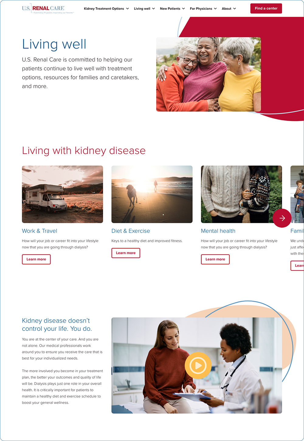
A streamlined navigation structure was implemented to make critical resources, like the clinic locator and “Healthy Living” section, more accessible. These updates not only improved content findability but also aligned with U.S. Renal Care’s goal of supporting patients in making informed health decisions.

One of the new value propositions requested by U.S. Renal Care was to promote healthy lifestyle adjustments to improve quality of life. The previous “Living with Kidney Disease” section was rebranded as “Healthy Living.” Through the card sorting exercise, we gained valuable insights into how to better organize the content.
The personas we identified included doctors, as well as new and long-term patients. These personas served as our north star as we prioritized the structure and placement of navigation, ensuring it was more intuitive and easier to use.
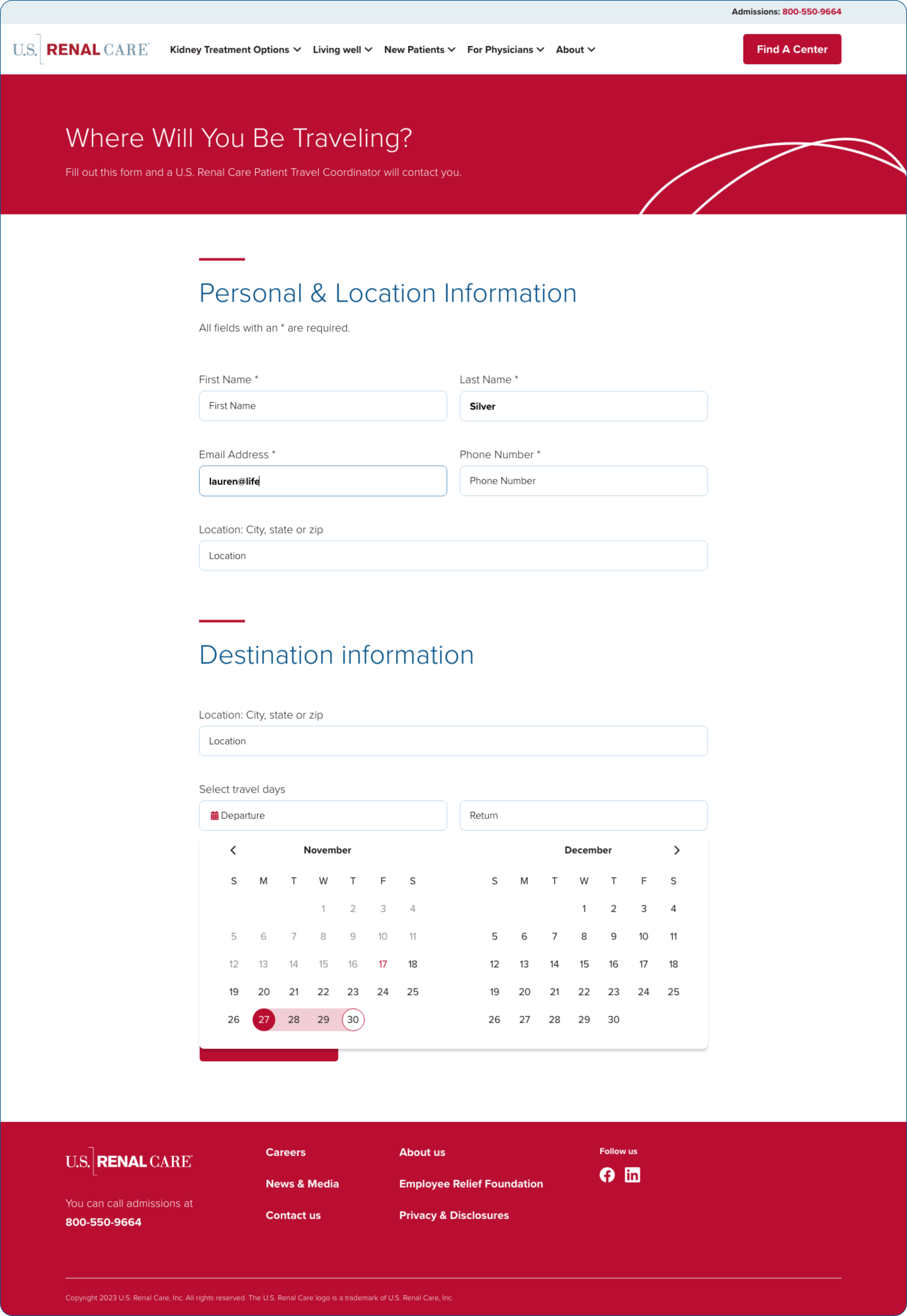
This is the first resource new patients turn to when determining if a clinic is near their home. However, it had navigation issues and provided limited details. Enhancing this interactive component became one of the primary priorities of the project.

Through a survey sent to the front desk staff, we identified critical information frequently requested by patients, such as directions and nearby locations relative to their home address. Including features like “Get Directions” ensures easy navigation, especially for users accessing the platform on their phones while on the go.

The platform immediately offers a “Search Nearby” function, ensuring a seamless and efficient experience for mobile users.
This is the first resource new patients turn to when determining if a clinic is near their home. However, it had navigation issues and provided limited details. Enhancing this interactive component became one of the primary priorities of the project.

Branding
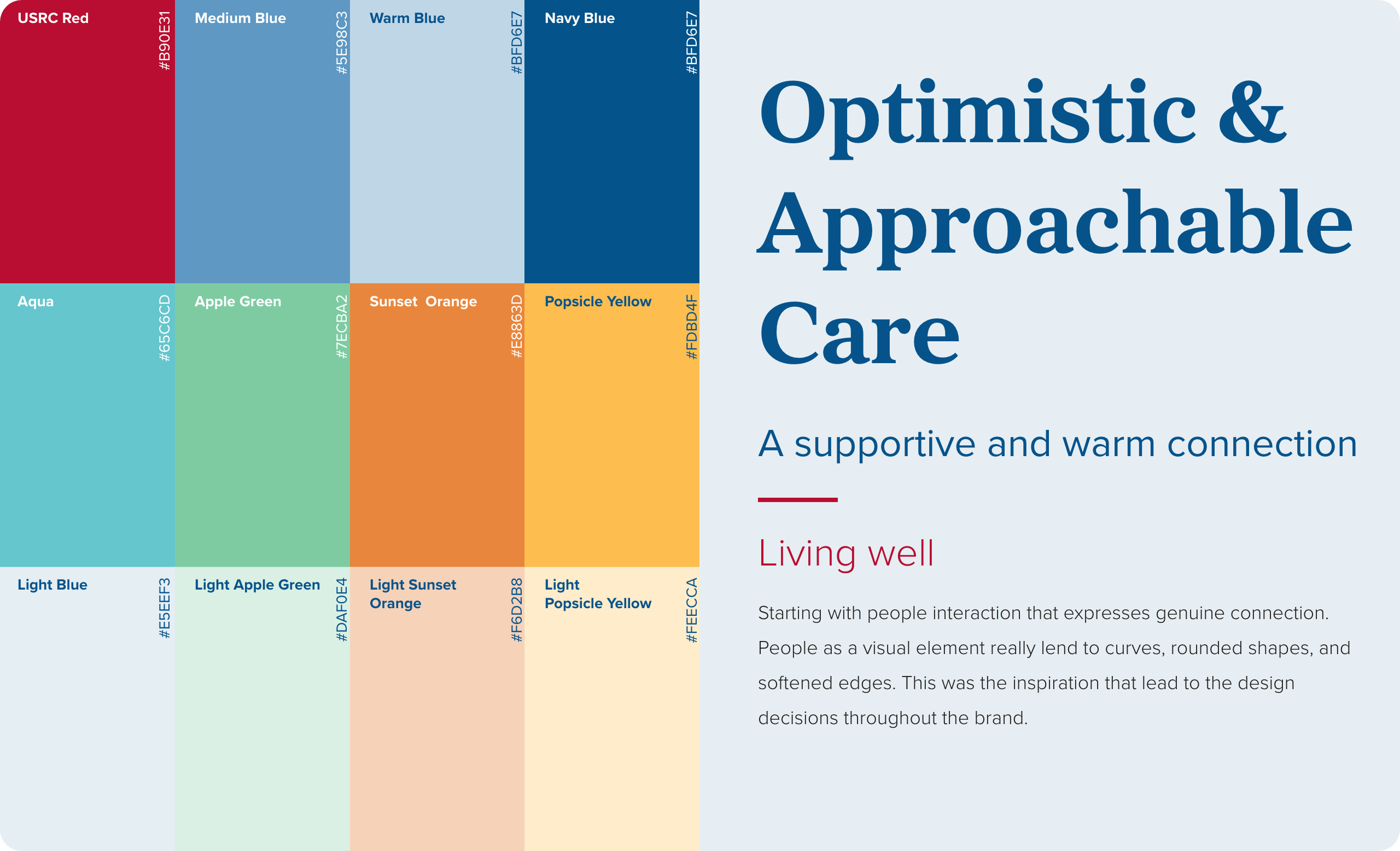
U.S Renal Care is a nationwide treatment care organization and the new brand honors its commitment to improving the quality of life of its patients. The new brand exemplifies optimism, strong caring connection amongst its staff and patient relationships, provides easy communication and access to resources, and support for maintaining a high-quality of life.
Design
The new USRC brand is inspired by people connecting through genuine touch that expresses connection. People as a visual element lend to curves, organic shapes, overlapping elements, and rounded edges.


This was a rewarding experience. Early on, the client was enthusiastic for the new brand direction because it better communicated their values.
Including Tailwind components. Working in tandem with front-end developers and understanding the technical specs for creating components so they can implement Tailwind library. This achieved a smoother, faster workflow during development.
Simplicity vs. verbose. It is always a delicate balance when trying to achieve clear guidance with brief title names. There was a lot of back and forth in ensuring we got the language, length, and description just right.
Understand technical constraints. The Find a Center functionality went through a few iterations based on the technical ability of the team as well as timeframe for the project.
